Engage and guide the user with a three-step animated form created using CSS3 and jQuery
Web forms can often be overlooked when it comes to designing and developing our webpages. If we think about the user experience and how this affects user interaction, then making more fun and interesting forms is certainly something we can all start thinking about. Of course the first thing we do is make sure our forms work and we then make sure they are styled, however more often than not that is where it ends. If it works and it’s styled accordingly, then we’re happy. But where’s the fun in that, right?! What if we added some animation to our forms and really enhance the UX, as well as the UI. Well in this tutorial, we will do just that. We’re going to use CSS3 animations coupled with a bit of jQuery. The finished form will be a three-step process and can be any type of form you want. Perhaps this could be a survey or a quiz that could easily be added to any page on your website. The beauty of this effect is that you can get as creative as you wish by using different types of animations. As always, we encourage you to experiment with the code once you’ve completed this tutorial. So open up your editor and let’s get started!
Step 1:- Get started with the HTML
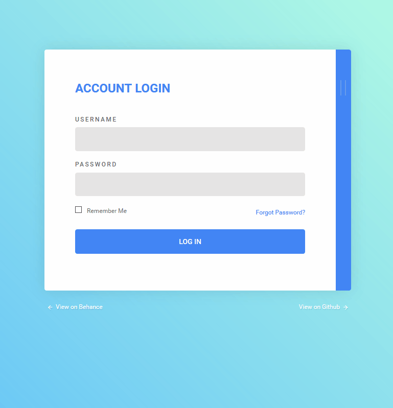
As already mentioned in the introduction, this tutorial will be a three-step process, so naturally we need to begin with step one. We will start by opening up a wrapper div and call it ‘form-wrap’. The empty tags will be used to show what active step were on, and then we will add in some content to tell the user what to do
<div class=”form-wrap”>
<div class=”form-header”><span class=”is-active”></span></span></span></span></span></div>
<div class=”form-bodies”>
<div class=”form-body form-body-step-1 is-showing”>
<div class=”title”>Step 1</div>
<div class=”description”>Fill out your details and click “Begin”.</div>
Step 2:- Add the form
Following on from the last step, we will add in a basic web form. The form will just include two input fields with placeholder text, but you’re welcome to add as many input fields as you wish. Then we will add in a button so the user can be taken to the next step.
<form>
<input type=”text” placeholder=”Your Name”/>
<input type=”email” placeholder=”Your Email”/>
<div class=”text-center”>
<div class=”button”>Begin</div>
</div>
</form>
Step 3:- Create a head for step two
In the next step of our form we will ask the user a question with at least two answers to choose from. Similar to the first step we will add in the form-body class name and then add in a new class called form-body- step-2. Then give it a title of ‘Step 2’ and then finish up with the question.
<div class=”form-body form-body-step-2”>
<div class=”title”>Step 2</div>
<div class=”description”>Do you consider
yourself a...</div>
Step 4:- Give answers for step two
For the answers we will need to add in another form. The form will contain radio buttons so the user can easily pick which one they want. Then we can add in the class name of text-center, which we will target later using our CSS to centre our button.
<form>
<label>
<input type=”radio” name=”radio”/>Web designer?
</label>
<label>
<input type=”radio” name=”radio”/>Front-end
developer?
</label>
<div class=”text-center”>
<div class=”button”>Next</div>
</div>
</form>
</div>
Step 5:- Work on step three
In this last step of the form, the user will be told the form is now done and they can run through the form again. We will add in a new button called rerun-button and allows the user to go back to the beginning. Then lastly we need to add in the links to the jQuery library first and then our custom script file.
<div class=”form-body form-body-step-3”>
<div class=”title”>Step 3</div>
<div class=”description”>Click “Done” and
let’s do this again shall we...</div>
<div class=”text-center”>
<div class=”button”>Done!</div>
</div>
</div>
</div>
</div>
<div class=”text-center”>
<div class=”rerun-button”>Go Again!</div>
</div>
<script src=”https://code.jquery.com/
jquery-2.2.4.min.js”></script>
<script src=”js/myscripts.js”></script>
Step 6:- Work on the CSS
Firstly we will add in a nice blue radial gradient to the whole page and then we have set the font family to Roboto. Next up will be the title of our pages. We want these titles to be nice and prominent on the page so users know what step they are actually on.
Step 7:- Add description and styles
In each step of the form there will be a snippet of text that either asks the user a question or lets them know what to do next. So we will style this text using the class name ‘description’. Then we will also give the input fields that sit underneath some styling.
Step 8:- Finish the input fields
To finish styling the input fields we will add in a blue border on the focus state of the fields. This is to help the user know what field they have clicked on. Then we will push the titles of the radio buttons over to the right slightly by adding a 15px right margin to each one.
input[type=”text”]:focus,
input[type=”email”]:focus {
border-color: #0e98df;
}
input[type=”radio”] {
margin-right: 15px;
}
Step 9:- Label step two
In the second step of our form, we wrapped the two questions within labels. With that done we can now give them some styles. Most of the CSS is self-explanatory, however we want to pay particular attention to giving the labels a light grey border above and below, with a decent amount of padding.
label {margin-bottom: 20px;display: block;font-size: 18px;color: #666;border-top: 1px solid #ddd;border-bottom: 1px solid #ddd;padding: 20px 0;cursor: pointer;}label:first-child {margin-bottom: 0;border-bottom: none;}
Step 10:- Style the buttons
The next step is to add some styles to the buttons. The buttons will be the ‘begin’, ‘next’, ‘done’ and ‘go again’ buttons. These will be set to blue with white text and a simple hover state with a subtle transition
Step 11:- Add rerun button
The rerun button needs a bit more attention than the others. This is because we want this button to be hidden using display: none and then use jQuery to reveal it once all the steps have been completed. And because this button will be on the blue background and not the white form, we will give it a white border and a subtle drop shadow to make it more prominent.
Step 12:- Target form wrap and header
Now we can begin to start giving our form some shape by targeting the form-wrap and form-header classes. We will give the form a width of 600px, and then centre it. Then we will give the form a transition for when it’s finished and begins again, making the form slide out when done and then back in again once the ‘go again’ button is clicked.
Step 13:- Style span tags
The span tags we added will appear as page indicators that are similar to breadcrumbs. They will be 12px circles and will be placed at the top of our form pages and the span tag will only turn blue for the page that is active.
.form-header span {display: block;height: 12px;width: 12px;margin: 5px;border-radius: 50%;background: rgba(0, 0, 0, 0.2);}.form-header span.is-active {background: rgba(0, 0, 0, 0.4);background: #0e98df;}
Step 14:- Use the perspective property
When we start playing with transforms and the 3D space, we need to make sure that the elements aff ected will have the perspective property assigned to them.
Step 15:- Postion form bodies
Now we need to make sure that our form bodies are positioned relative so they can be animated and then we will give our forms some default styling, such as making the background white and giving them a drop shadow. Then we set the display mode to none so we can bring them back in again when animated.
.form-bodies {position: relative;perspective: 1000px;}.form-body {background: white;padding: 40px 100px;box-shadow: 0px 50px 30px -30px rgba(0, 0,0, 0.3);margin-bottom: 50px;position: absolute;top: 0;display: none;box-sizing: border-box;width: 100%;transform-origin: top left;}.form-body.is-showing {display: block;}
Step 16:- Animate out and in
In this step we will add in a few class rules that will be triggered using jQuery. This CSS rules will occur when the form buttons are clicked and the class names will be added dynamically using our script. The animate out creates a swing animation and the animate in is after that swing animation occurs and the form animates back in.
Step 17:- Work with @keyframes
So we have now specified the out and in animation, but we haven’t created them yet. We can do this by using the @keyframe rule. So the out @keyframe controls the way the form is animated out on the y axis and the in controls the way the form animates back in on the x axis.
Step 18:- Use jQuery
Now create a new script.js file and store it in a folder called ‘js’. Then open it up and begin adding our jQuery. In this first part we will add a click function to the .button class. This will trigger a few functions depending on what step we’re on and also set a few variables.
$(‘.button’).click(function(){
var $btn = $(this),
$step = $btn.parents(‘.form-body’),
stepIndex = $step.index(),
$pag = $(‘.form-header span’).eq(stepIndex);
if(stepIndex === 0 || stepIndex === 1) {
step1($step, $pag); }
else { step3($step, $pag); }
});
Step 19:- Add a function for step one
So let’s say you clicked the next button, which has the .button class. This will trigger the step one function that begins by adding a new class called animate-out. This will then trigger the animate-out CSS rule and our animation will occur
function step1($step, $pag){
// animate the step out
$step.addClass(‘animate-out’);
Step 20:- Animate in
After we have animated step one out, we need to animate in the next step in the form, which is of course step two. But we don’t want this to happen too quickly as we need some time to do the required animation using CSS. So we used the setTimeout function to delay the animation for 600 and then 1200 milliseconds.
// animate the step in
setTimeout(function(){
$step.removeClass(‘animate-out is-showing’)
.next().addClass(‘animate-in’);
$pag.removeClass(‘is-active’)
.next().addClass(‘is-active’);
}, 600);
// after the animation, adjust the classes
setTimeout(function(){
$step.next().removeClass(‘animate-in’)
.addClass(‘is-showing’);
}, 1200);}
Step 21:- Animate for step three
The next bit of script will fire off the step three function. Again we’re going to add the class animate-up which will trigger that CSS animation, and then using the setTimeout function we can set a delay enough for us to then display the re-run button, which we called ‘go again’.
function step3($step, $pag){
// animate the step out
$step.parents(‘.form-wrap’).
addClass(‘animate-up’);
setTimeout(function(){
$(‘.rerun-button’).css(‘display’, ‘inline-
block’);
}, 300);}
Step 22:- Rerun button
In this last step we want a function that sets everything back to the beginning once the rerun button is clicked on. So we first remove the animate-up class and then add and remove other classes on the form wrapper. Lastly we will hide the rerun button and then we can go again.
$(‘.rerun-button’).click(function(){$(‘.form-wrap’).removeClass(‘animate-up’).find(‘.form-body’).first().addClass(‘is-showing’).siblings().removeClass(‘is-showing’); $(‘.form-header span’).first().addClass(‘is-active’).siblings().removeClass(‘is-active’); $(this).hide();});
Please Support Us By Clicking on the above ads...